


What makes a great theatre poster?
Exeunt's highly subjective history of the coolest fonts, best visual puns, and most memorable designs


By Holly Williams
Theatre posters, like all forms of advertising, are subject to the whims of fashion – to look back over decades and centuries of theatre posters is to see a broad movement from dense piles of text to stylised illustrations, from bold simplicity to photo-led glossiness. Posters chart the progress of not only theatre as an artform, but also the development of advertising language, the technology of mass reproduction, and the broader tastes and values of an age. And while there’s always been cross-pollination between ads for theatre and other artforms, there’s often been something distinct about theatre posters. You know it when you see it: that’s theatre!
But recently, I was struck by the vehemence of my own recoiling at a few posters that seem to deliberately resist the that’s theatre instinct. The ad for recent West End show Barcelona made me do a double take: it absolutely looked like it was promoting a movie, not a play. The city-at-night reflectiveness, the scattered lights, the airbrushed image, the way the names are arranged… to the glancing eye, it reads film.
Then along came the poster for My Master Builder: same vibe. Something distinctly filmic in the colour grading; the font choice; the layout. Both posters were designed by Feast agency – but it looks to be a recent approach for them, rather than a house style (consider, for contrast, their punchier poster for An Enemy of the People, which somehow does shriek theatre).
Of course, slick photo-led advertising centring very famous screen actors has been around as long as very famous screen actors have also been doing plays. But this seems to be going one step further. Besides, I’m not the only one to spot the trend, and it’s not just happening in London – Howard Sherman recently wrote about the same phenomenon on Broadway in The Stage, noting how, thanks to close-up photography, movie-esque tag lines, and the layout of star names, a new ad campaign for The Last Five Years looks more like a film than a live performance (never mind a musical).
No doubt the intention here is that old laudable aim: to draw in a new audience to theatre. But it just seems… oh, what the hell, I’m going to be sentimental and say that it just seems a shame when theatre posters coldly ape another artform’s visual language instead of finding their own. Because theatrical posters have a long and illustrious legacy of distinctive design. And when they are good, they can be really, really good: works of art in their own right, or images that capture the elusive essence of a live show, sum it up pithily, or just pique the interest of the passerby.
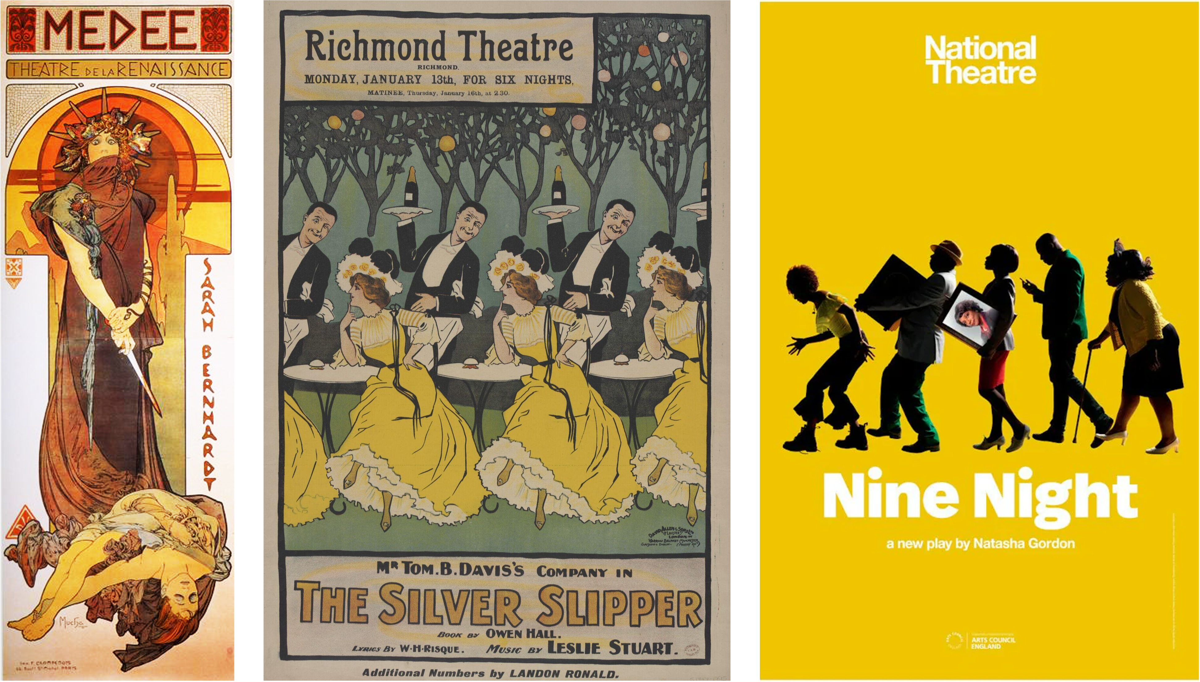
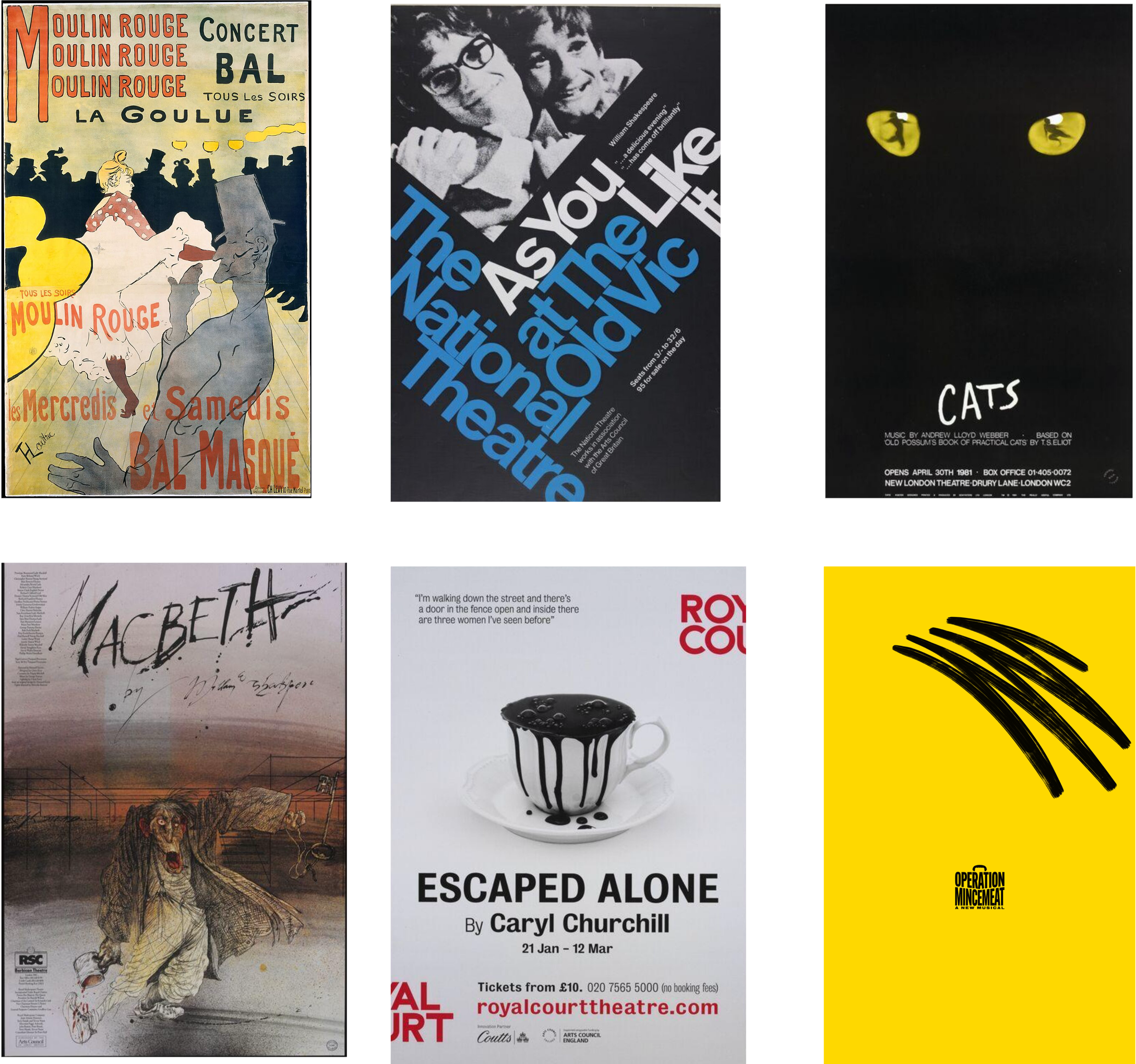
So – enough griping, and let the celebrating begin. The rest of this piece is dedicated to the theatre posters that I – and you – really love: I threw it out to Exeunt readers, who offered up plenty of their own faves. Several people harked right back to 19th century: the prettily swirling Art Nouveau illustrations of Alphonse Mucha got multiple shout-outs, with his fiery-eyed depiction of Sarah Bernhardt playing Medea in 1898 a clear favourite. Similar era, different style: Toulouse-Lautrec’s Moulin Rogue poster was also singled out by Exeunt writer Kate Wyver. “Everything Henri Toulouse-Lautrec painted draws you into the velvet booth next to him, the act you’re watching just obscured by a fur hat or curl of smoke. I love the bright yellow poster advertising the performers at the Moulin Rouge, including the ‘boneless’ acrobat and the cancan-kicking dancer La Goulue, ‘the glutton’.”
A named artist can help stick posters designs in the memory, it seems. Ralph Steadman’s distinctive and darkly evocative posters also drew much praise, with his scratchy, hellish illustration of Macbeth and his unnerving collage for The Merchant of Venice named specifically by different readers. His posters are brilliant because not only do his hand-scrawled images and titles seem to sear the memory, but – as Mike Ingham pointed out on Bluesky – they also serve the show: “The focus is the production, the atmosphere, the design … the experience you're going to have as an audience.”
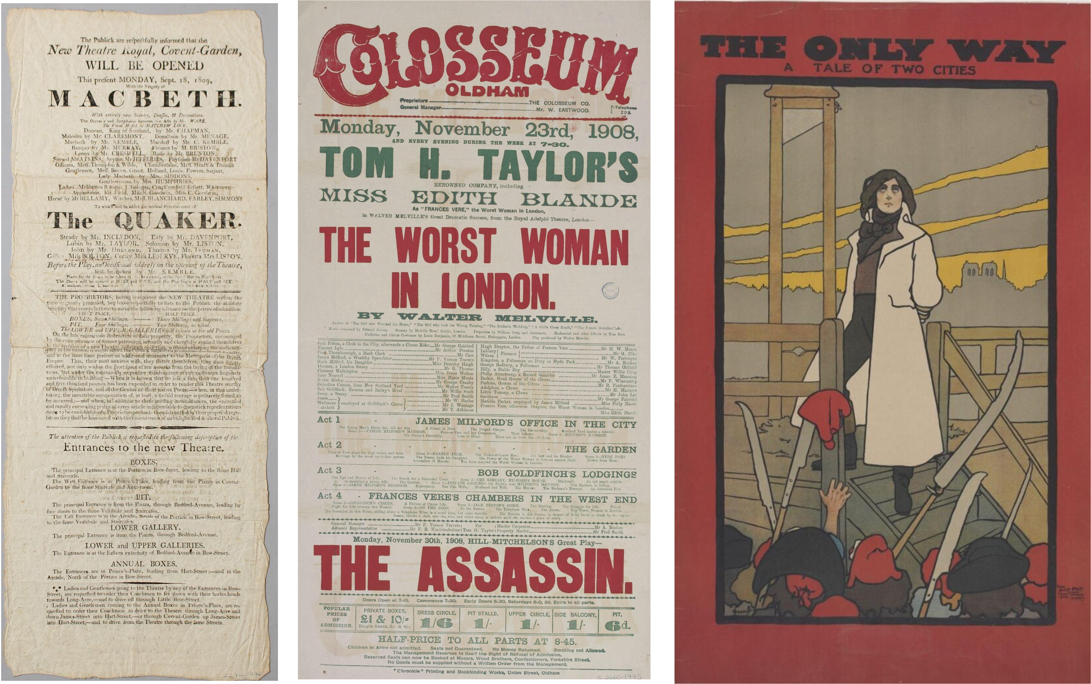
Yet for much of British theatre history, the poster was a text-based affair, rather than pictorial. “There are a series of phases,” explains Jane Pritchard, a curator from the V&A’s Theatre and Performance department, as we discuss their incredible collection of literally thousands of carefully preserved theatre posters, from all eras. “In the 19th century, posters have got a mountain of text. It’s a document to be read – different terms, really, to a poster that’s there to be eye-catching on the wall. But by the end of the 19th century, particularly with the development of printing and colour printing, you’ve got some wonderful images.”
Our minds may leap to the world of charming vintage illustrations – but it’s not all stylised circus performers or women in big frocks. Pritchard points to the haunting illustration in The Only Way, from 1899 – an adaptation of A Tale of Two Cities that advertised itself with a picture of the guillotine. As a depiction of the French Revolution, she points out drily, “it’s a real contrast to Les Mis…”
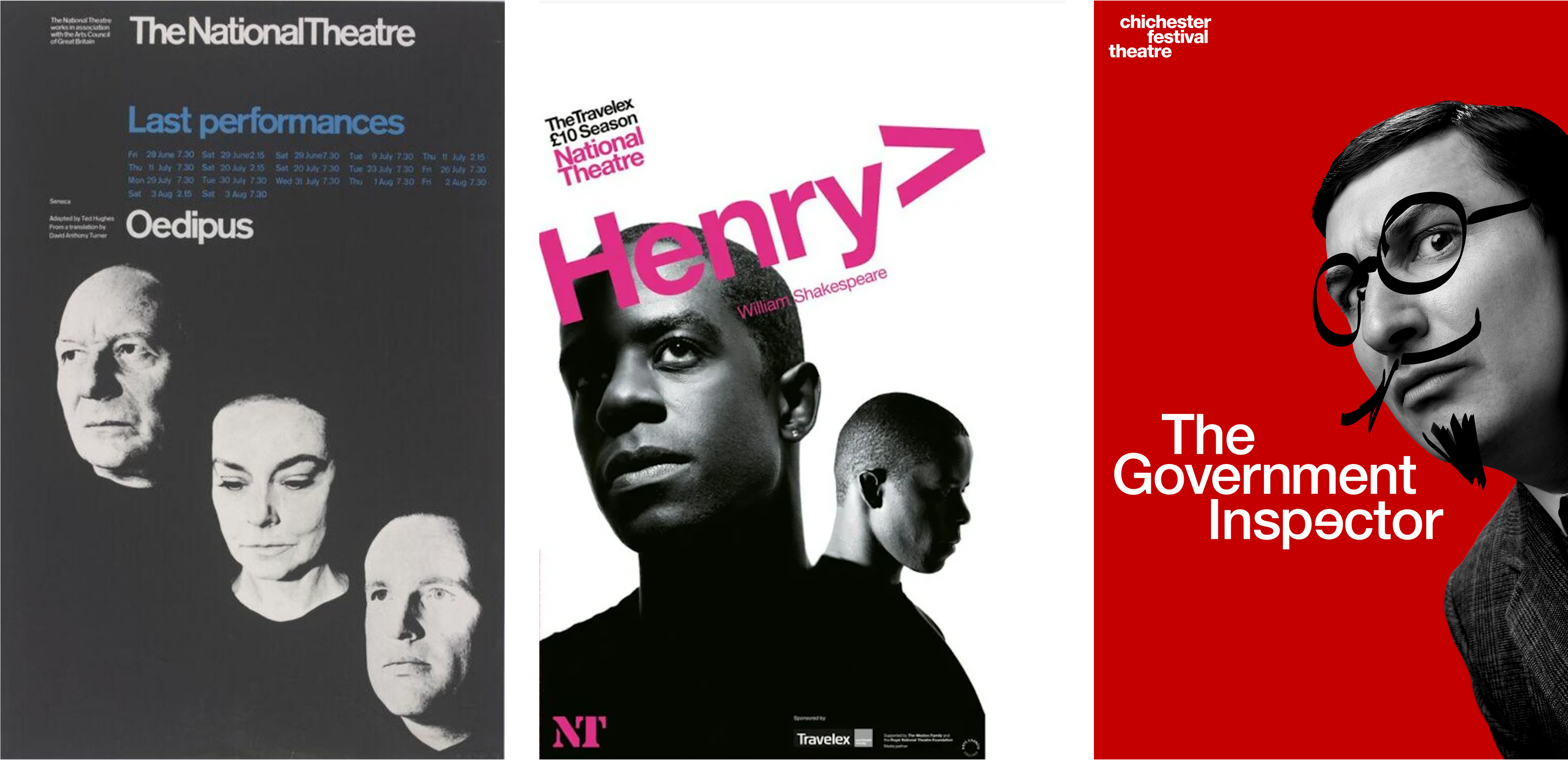
But then the trend swung back to text again; information, not illustration. The next big leap forward comes in the 1960s, Pritchard suggests, with the affordable use of photographs on posters: “And if you have a very strong image, you don’t need a great deal more.” Pritchard points, in particular, to the early seasons of the National Theatre – such a chic series of posters, I could happily have included any of them in this piece, all following a blueprint of bold photo, chunky sans serif title, and little else. This formula is so winning, it’s been revived and replicated in contemporary NT posters since the early 2000s, to often brilliant effect. It feels classy and current, as well as suggesting a theatre in dialogue with itself.
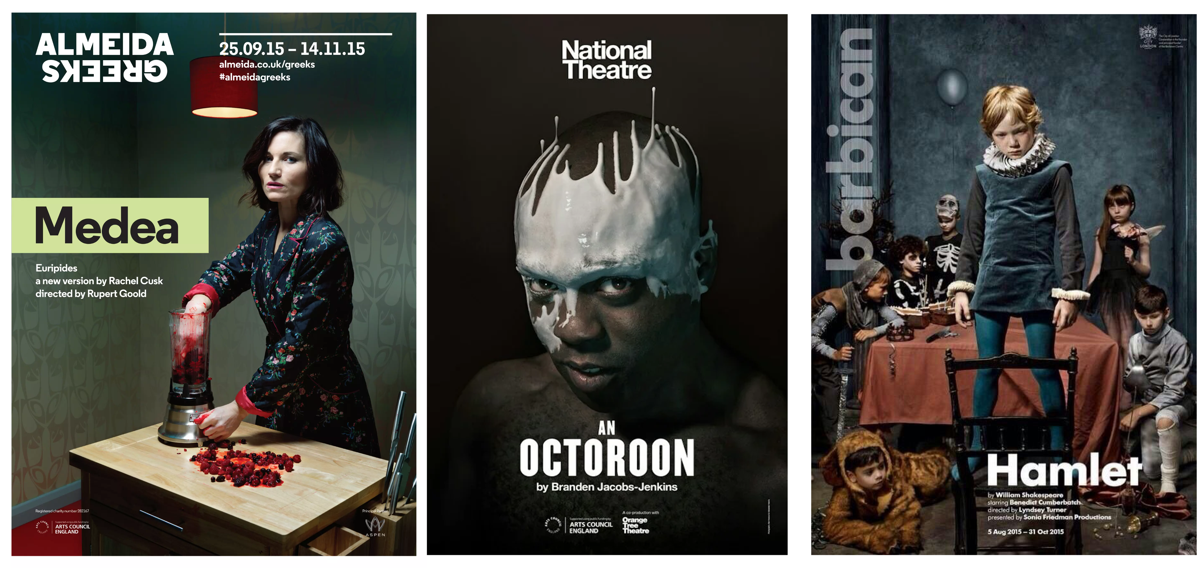
The NT’s recent(ish) posters got loads of shout-outs, with love for Angels in America, An Octoroon, The History Boys, Mother Courage, and The Motherfucker in the Hat; some of my own favourites include Nine Night, Everyman, and Henry V. The success of the crisp, clean, slightly retro font-and-picture style has been hugely influential: you can feel its stamp surely, on the posters for several recent seasons at Chichester, as designed by Bob King Creative. Also mentioned with fanish ardour were the retro designs adopted by the Royal Court around 2017/8. Resembling mid-century posters or book covers, there was an elegant simplicity and effortless cool to the designs: the posters don’t give you much to go on, beyond the name and playwright – an invitation to just trust the Court’s programming. I loved them too.

But to step back into the poster-development timeline for a moment – let’s zoom back in, in the 1980s, which was a big decade for big ads. It was the era of the brand recognition, where a hit show needed an endlessly replicable icon – think Cats, Les Mis, The Phantom of the Opera, The Lion King. Astonishingly, those enduring mega-musical images were all designed by the one theatre design agency, Dewynters. It’s fair to say, they powerfully shaped our idea of what a theatre poster is or could be.
Pritchard singles out the Cats poster, in particular. “It actually sums up a good poster: it tells you it’s about cats; it tells you it’s about dance, with the images in the eyes; it doesn’t give you tons of information, and it works incredibly effectively on the front of the bus and going up the Underground. If a poster grabs your attention as you whip past it on the escalator, and you want to know more, you’re doing alright.”
Dewynters still design huge numbers of posters, and their long-time creative director Bob King also set up his own agency – coming up with a more recent design that also lives up to the true meaning of ‘iconic’: Operation Mincemeat. It’s poster is a modern classic, highly effective in its simplicity. And with its scribble of hair, and a title that’s also a suitcase that’s also a Hitler moustache, it pulls off the same trick as the Cats poster: few images, doing several things.
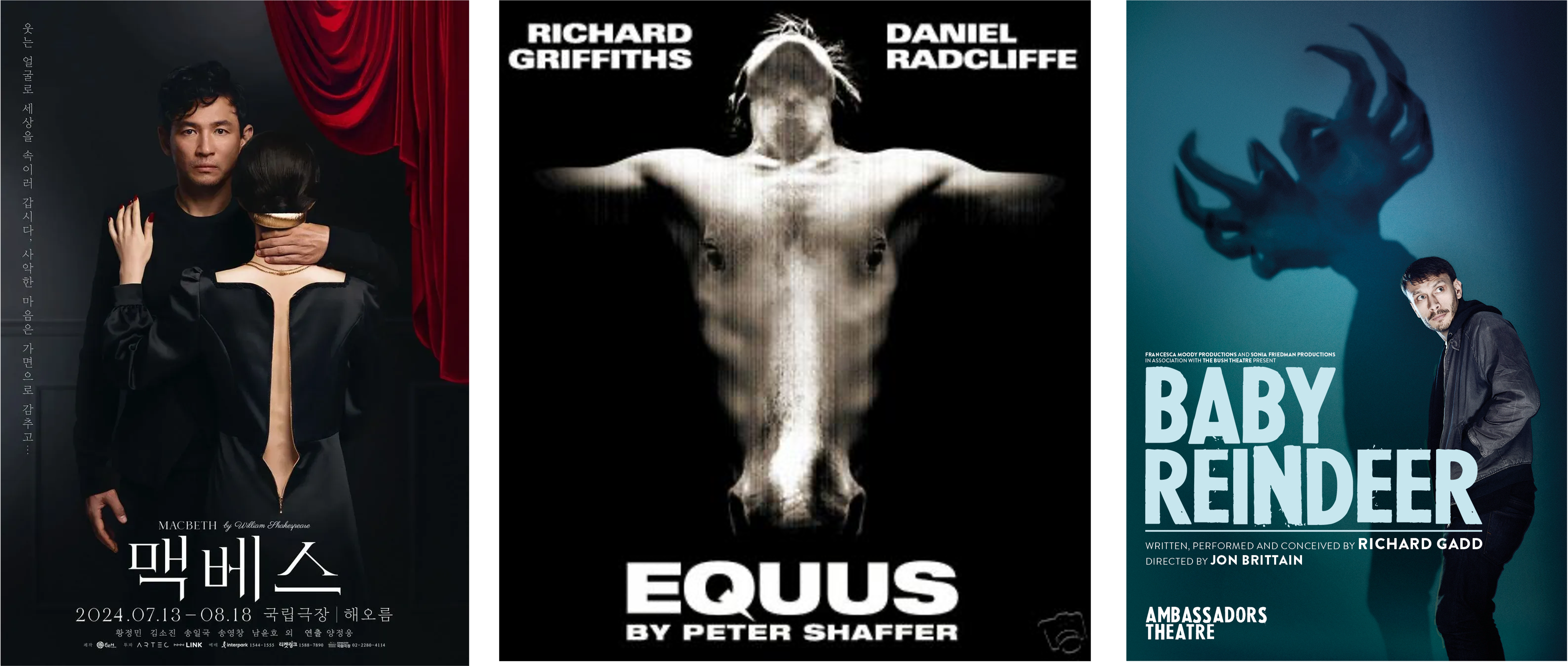
And this sense of a double-meaning or a visual pun seems to be feature of posters that stick in the mind – or at least, in the mind of Exeunt readers. You expressed an appreciation of the original poster for Caryl Churchill’s catastrophic tea party, Escaped Alone, with its ominous black sludge in a teacup. Or the theatrical poster for Baby Reindeer, its shadowplay suggesting both a reindeer and the grasping hands of a stalker. Or Daniel Radcliffe in Equus (another Dewynters’ design), both torso and horse’s head. And isn’t that so much more interesting than just some flattering photo of a very famous face? Another reader also praised the “dark AF” poster for Hamlet at The Barbican, with brilliantly eschewed a soft-focus celebrity in favour of something much weirder. Yeah, they could have had a close-up of Benedict Cumberbatch, but instead they went for creepy kids in fancy dress. It was strange, and confident, and theatrical.
Another campaign mentioned several times, by people who hadn’t even seen it, was a Korean Macbeth, where the poster made canny use of negative space. “I remember seeing these posters by Yuni Yoshida and being completely awed by them,” says Wyver. “I wonder if the show lived up to the sultry slickness they promise…” So satisfying were these designs, they briefly lit up the internet – an additional aim, these days, for any designer, of course. Your images need to work blown up on the side of a building but they also need to work on a tiny phone screen; to grab attention or be shareable online, with the hope of carrying interest from a digital space to a real place.
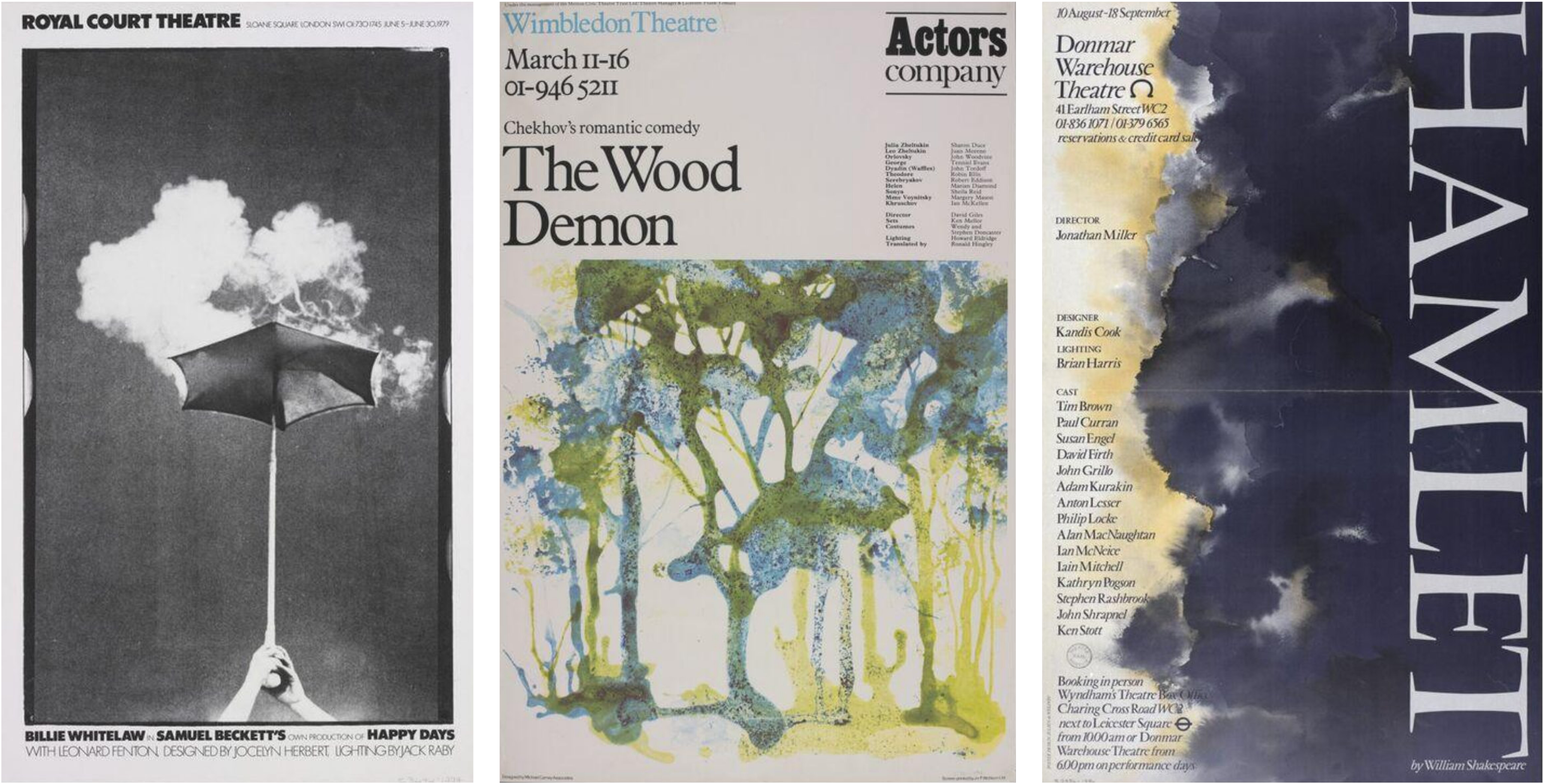
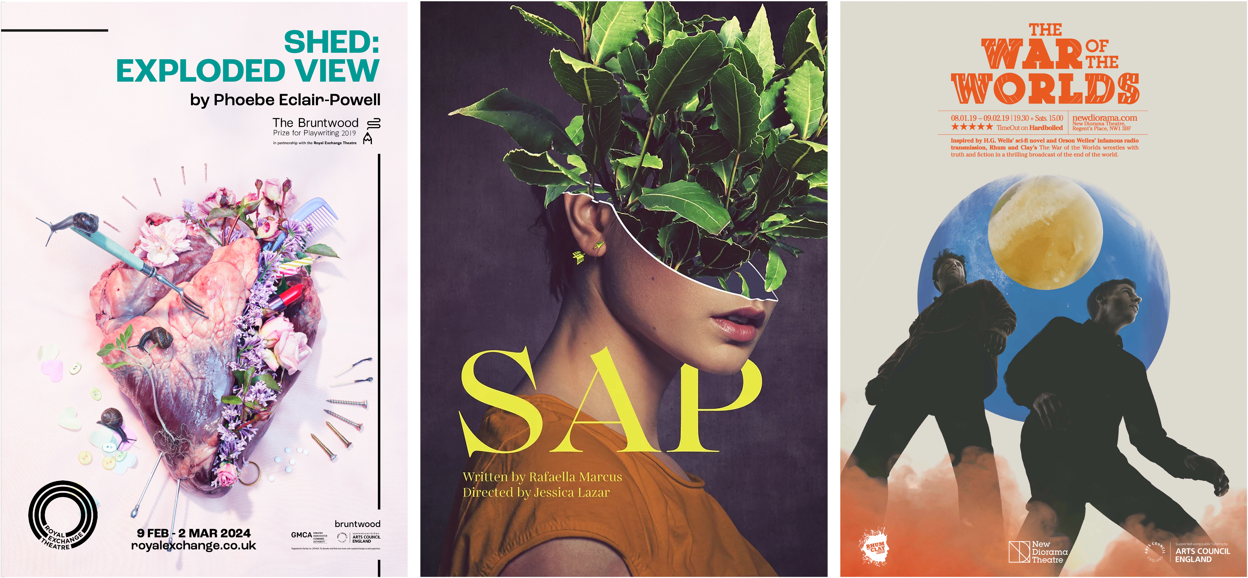
It's interesting, that most of the recent-ish posters that people love and remember seem to be these kinds of designs: bold, simple, clever. Still, looking back through the V&A’s archives, I was struck by the evocativeness of some offerings from the seventies and eighties – with a softer, more artistic aesthetic: see the Donmar’s watercolour Hamlet, a surrealist Happy Days, or the painterly The Wood Demon. There are modern echoes of this approach, too, even if they’re less common and also still less hand-made looking; readers praised the surrealist elegance of Rebecca Pitt’s Sap poster, and the work by Guy J Sanders for New Diorama Theatre, combining subtle text with vividly collaged imagery.
One of the posters that made me want to write about this topic at all was Felicity McCabe’s for Shed: Exploded View at the Royal Exchange. Her creepy-doll-face poster for John and defiant-young-women Crucible posters, both for the NT, are also great. But it is Shed which, for me, does all the things I think a theatre poster should: it immediately grabs attention, with its combination of pastel prettiness and disturbing imagery; it intrigues, being both beautiful and horrible (what is a fork doing in a heart? What is the tone here?) And once I’d seen the show, it also worked as a representation of the fragmentary form of the play, its inspiration, and its content – reflecting this story about love and about violence. Plus, it looks just as good blown up massive on the side of a building or on a small square on your phone screen.
Pritchard points out that the digital world should have further liberated theatre posters: really, you need to do even less in an advert these days, because we can all google if we want more information. So surely we should be in a golden age for inventive, eye-catching, abstract, arty designs? Pritchard is not convinced. “One of the problems is people trying to put too much information on the poster,” she observes; and needing to slap on multiple sponsors or fit in multiple venues on doesn’t help, of course. But ever since we moved from words to pictures as the main medium, she thinks designers could do with doing less, in general.
“For me, a poster is something to whet the appetite. A poster is a starting point, more than anything else.”
Explore the V&A’s Theatre and performance collection online or at the gallery in London, where they run daily tours.
 | A guest post by
|